2017年4月30日星期日

Arch1101 Assessment 2 Final

Sketchup Model download Link: https://www.dropbox.com/s/1d40niqeh6mr2rj/model.skp?dl=0

18 Sketches of Axonometrics


36 Textures


Text:
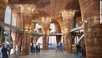
The station is built based on the combination of concepts of “the distance between nature and architecture can change people’s experience” inspired by Vo Trong Nghia and “the space between is more important inspired from Carlo Scarpa.
  The station can be divided into two parts. One is designed by Vo Trong Nghia which can be regarded as an element of nature. And these tall columns enlarge the space of the station.  And while experiencing at the station can bring people a sense of warmth because of the material of wood.


Another part is mostly inspired by Carlo Scapa.  I set some board on the top of celling but left space between each other which can add more elements to the architecture and make it more abundant. Moreover, Scarpa is a very famous architect for the use of line.

In conclusion, the period of building the station taught me how to arrange space by using geometrics and how to give people feelings by using materials.

5 Pictures of The Station


2017年4月12日星期三

Ziru Wang's Work of Exp2 1st Week


1. Dissolve the distinction between the interior and exterior

2. The space between is more important


3. Architecture mimics natural elements and cultural values


4. Monolithic architecture becomes refined in the detail

5\
5. Monolithic architecture becomes refined in the detailComplexity meets simplicity


6. Tradition brings warmth to contemporary architecture


2017年4月3日星期一

Ziru Wang's additional work

Ziru Wang's additional sketches


Ziru Wang's additional stair
Model

Sketch 
For Chris,

I am so sorry that I make some trouble work because of misunderstanding of some of works and I didn't upload my works on time. Therefore I update some of my works just to show I understand it now. And I'm so sorry that let down.

                                                                                                                       Your Student, Frank Wang

2017年4月2日星期日

Ziru Wang's Work of Week 4

4 Videos Including 1 view from outside with the underground part and 2 interior view of the above ground part. And the section screen
The section of my work.
The building I set it on the mountain and I designed the above ground part as a studio with a large show room.
For the above ground part, The top floor of the building is designed for relaxing and view the landscape of the mountains.


 The hight of the ground floor I designed very low in order to be compared with the second floor. 

In this way I enlarge the second floor and people will feel that the space larger.

 As for wall and windows, I don't close the room tightly for two reasons. The first reasons is that I make the inner space firstly so sometimes there are some wall I found that I cannot close them. The second reason is that I find this semi-open style can enlarge the space. There for I choose the semi-open style.


And the main element of my above ground part is geometric which I get the inspiration from Issey Miyake so I use triangles mostly.

For the under ground part I designed is as a cave. Because the main element of my building is "original" which I get from Louise Bourgeois. I think the design mixed with the landscape (mountains) can make it more brilliant. 

As for textures, I choose reflection which is symmetrical, natural which made up by leaves and stable which looks like ropes.